A Wrinkle in Time

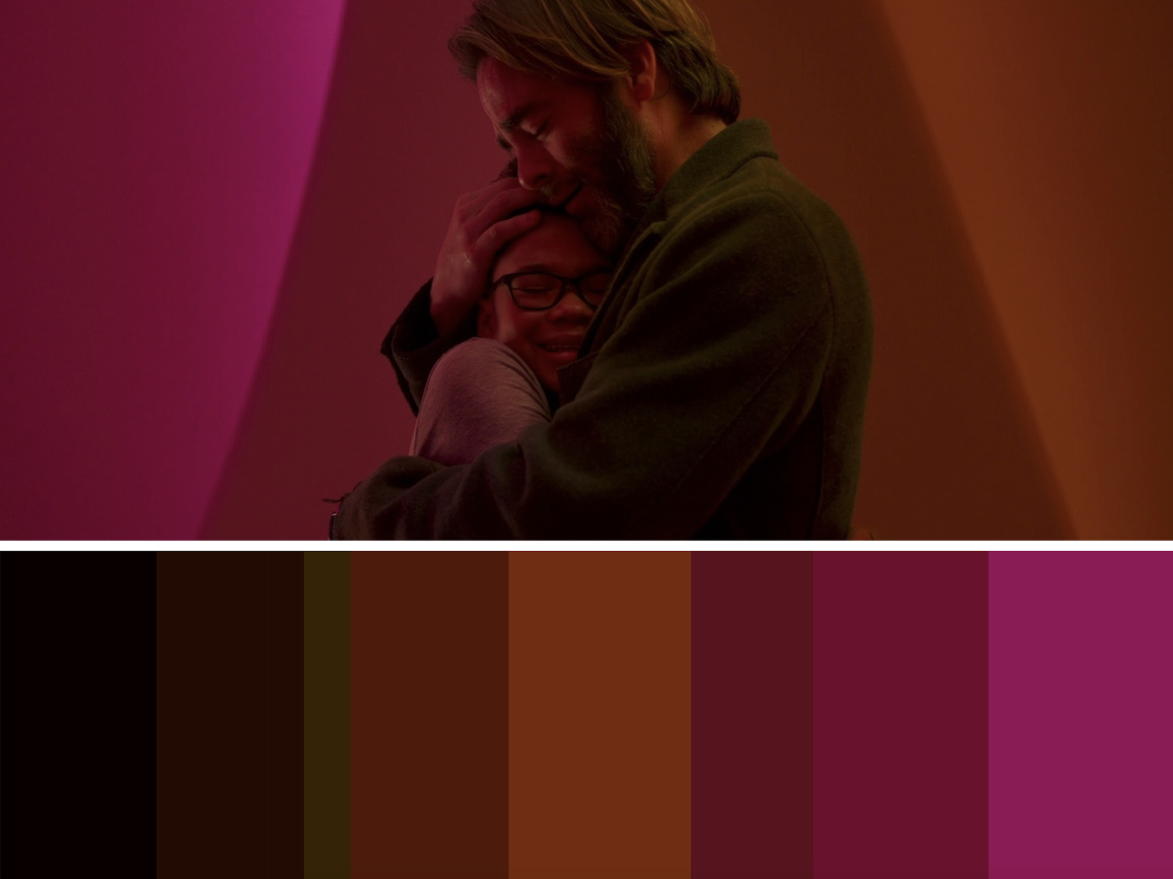
For some background, two kids haven’t seen their father in 5 years. He’s a scientist who discovered a new planet and used a tesseract to travel there. The kids and a classmate are guided to the planet by three astral travelers. There they face the new planet and the evil it possesses.

I created three palettes. The first two are very similar scene wise but are completely different with the colors used. Both are geometric with a human figure in the center catching the eye because of their organic shape. The first palette as a wide range of orange with a touch of yellow. The dark drown of the characters clothing contrasts with the pale yellow also in the center. Our eyes are carried to the center with the lightening range of orange shades. This is the same idea with the second palette but with a shade range of reds and pinks. The third palette is the shades from the first two palettes coming together as one. This is mirroring what is happening in the scene from the characters separate on their own then coming together at last. The first two palettes are definitely my favorite out of the three because of the nice shade range. Each color flows into one another nicely. The third palette in my opinion doesn’t flow as nice, but knowing the relation to the scene makes up for that.

Film Grab. (2019, July 12). A Wrinkle in Time. Retrieved from https://film-grab.com/2019/07/12/a-wrinkle-in-time/#

Film Grab. (2019, July 12). A Wrinkle in Time. Retrieved from https://film-grab.com/2019/07/12/a-wrinkle-in-time/#

Film Grab. (2019, July 12). A Wrinkle in Time. Retrieved from https://film-grab.com/2019/07/12/a-wrinkle-in-time/#

Film Grab. (2019, July 12). A Wrinkle in Time. Retrieved from https://film-grab.com/2019/07/12/a-wrinkle-in-time/#

Film Grab. (2019, July 12). A Wrinkle in Time. Retrieved from https://film-grab.com/2019/07/12/a-wrinkle-in-time/#

Film Grab. (2019, July 12). A Wrinkle in Time. Retrieved from https://film-grab.com/2019/07/12/a-wrinkle-in-time/#

Director: Ava DuVernay

Producers: James Whitaker, Catherine Hand

Director of Photography: Tobias A. Schliessler

Production Design: Naomi Shohan

Costume Design: Paco Delgado

Distributor: Walt Disney Studios Motion Pictures

Year: 2018

Spider-Man: Into the Spider-Verse

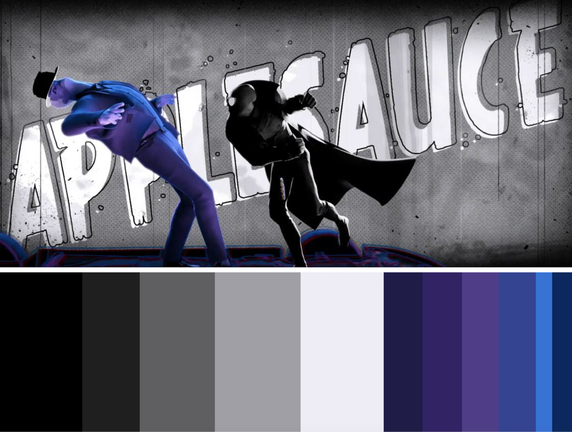
For the palette this week I chose Spider-Man: Into the Spider-Verse. It’s a little different than my past posts for a couple of reasons. One being it’s the first cartoon movie that I have chosen. The second being that I actually made two palette. These were really fun to do and the scenes were unique with their colors. I couldn’t choose one so I decided to post them both.

Straying from the original Spider-Man stories, a teenager, Miles Morales, is bitten by a radioactive spider. As we know this gives him the power to transform into Spider-Man. What is different it that there are multiple people who share this mysterious ability and Miles realizes that once he meets Peter Parker. Miles has to use his new power to battle Kingpin who can open portals to other universes and pull other versions of Spider-Man into Miles’ world.

The first palette contains many different cool tones. I chose this scene mainly because I enjoyed the colors and the composition along with he typography. It’s consists a lot of blue and teal shades, with a pop of red and green. The white type is able to stick out because it’s so different from the background and the detail of the black around them allows for depth, as well as adding to the comic book feeling.

The second palette is super cool because it’s all black and white then one character is in color. I tend to lean more towards cooler tones myself so I enjoy that the color used are blue and purple shades. Towards the bottom of the screen still we see the blue blending into purple with the help of a red-maroon. This gives the effect of a vibration also making it look three dimensional. Again the typography sticks out because it’s so much brighter than the other colors and it also shares the black line around it adding to the comic book feeling.


Film Grab. (2019, November 12). Spider-Man: Into the Spider-Verse. Retrieved from https://film-grab.com/2019/11/12/spider-man-into-the-spider-verse/#

Film Grab. (2019, November 12). Spider-Man: Into the Spider-Verse. Retrieved from https://film-grab.com/2019/11/12/spider-man-into-the-spider-verse/#

Film Grab. (2019, November 12). Spider-Man: Into the Spider-Verse. Retrieved from https://film-grab.com/2019/11/12/spider-man-into-the-spider-verse/#

Film Grab. (2019, November 12). Spider-Man: Into the Spider-Verse. Retrieved from https://film-grab.com/2019/11/12/spider-man-into-the-spider-verse/#

Directors: Bob Persichetti, Peter Ramsey, Rodney Rothman

Producers: Chris Miller, Phil Lord, Amy Pascal, Avi Arad, Christina Steinberg

Production Design: Justin K. Thompson

Distributor: Sony Pictures Entertainment Motion Picture Group

Year: 2018


Edward Scissorhands

A scientist is building an animated human named Edward. Before he can finish building him, he passes. This leaves Edward with an unfinished, peculiar appearance with attention to his scissor hands. A saleswomen in the suburban town finds Edward and takes him home with her. There he falls in love with her daughter. He’s an outcast in the town and we can see that with the color used throughout the film.

This scene catches my eye because of the contrast of colors. We see light pastel shades within the town. Then in the reflection of the mirror it’s all dark pulling your eye in. My favorite part is the reflection because even within the mirror there is contrast from the mountain and house with the light gray-blue sky. The pastel blue and yellow along with he green and mauve shades gives off the feeling of a happy and “perfect” place. The reflection of the scientists home makes it feel scary and freakish, which can also be used to describe Edward even though his personality is the complete opposite. Edward is different from everyone and doesn’t fit in. This is also the same with the scientists home. The mixture of dark and light is pleasing to me and it reflects the mood of the film perfectly. We are given the idea of a fantasy romance which  is being supported with the colors.

Film Grab. (2019, July 12). Edward Scissorhands. Retrieved from https://film-grab.com/2012/12/20/edward-scissorhands/

Film Grab. (2019, July 12). Edward Scissorhands. Retrieved from https://film-grab.com/2012/12/20/edward-scissorhands/

Director: Tim Burton

Producers: Tim Burton, Denise Di Novi

Director of Photography: Stefan Czapsky

Production Design: Bo Welch

Costume Design: Colleen Atwood

Distributor: 20th Century Fox

Year: 1990

Nerve

I am completely drawn in to this movie because of its bright neon colors. Making a long story short, there is an online game that allows for people to join and be a watcher or a player. If you play you have to accept a series of dares which could be anything from simple dare to extremely dangerous ones. All players compete to be the last one standing in the end.

The colors in this still are very bright and have a wide range of colors. They pull the eye in while at the same time display the same mood of the scene. It’s exciting and like a celebration. The colors overlap and create new shades. We can see this with the red/maroon on the ceiling with the overlap of the yellow green letters. It creates a bright orange which if my favorite part of the palette. We continue to see this happen. Not only in this screen still but throughout the entire movie. When pulling colors to put into the palette I like to make sure I get all the colors without going overboard. I make sure I get the darkest shade of a color as well as the middle tone and lightest shade. I appreciate the pop of orange in the palette because it’s just one shade and gives a break to our eye as we see the other colors fading lighter.

Film Grab. (2019, July 23). Nerve. Retrieved from https://film-grab.com/2017/11/24/nerve/

Film Grab. (2019, July 23). Nerve. Retrieved from https://film-grab.com/2017/11/24/nerve/

Directors: Henry Joost, Ariel Schulman

Producers: Allison Shearmur, Anthony Katagas

Director of Photography: Michael Simmonds

Production Design: Chris Trujillo

Costume Design: Melissa Vargas

Distributor: Lionsgate

Year: 2016

Timelapse of Character Outline

Disclaimer: This posts contained different content from the original blog.

Being able to combine fictional characters into my work is one of my favorite things to do. I use my iPad with the Procreate app to design simplified versions of these characters. It’s super relaxing and I enjoy creating them a lot. In the time lapse I use a photo from my favorite tv show, which is Vampire Diaries. It’s easier for me to think about my work in sections. Throughout the video you see me outline the different parts of the character and then begin to fill it in. You have to think simple. I have an eye for detail so I can get carried away when making these but I have to stop myself. Of course some detail is needed but mainly it should be a simplified version of the character(s).


I create a simplified version of tv and movie characters on procreate. This is a time lapse of me creating one. This is a school assignment.

Alice in Wonderland

Following a white rabbit into a hole, Alice is taken to a magical universe where she is reunited with friends from her dreams. Later she finds out that she must defeat the Red Queen and put an end to her terror. She works together with her friends, the Mad Hatter, the Cheshire Cat, and others with the help of the White Queen who happens to be the Red Queens sister. The screen still we see below is of Alice and the White Queen in her castle. I specifically chose this still because of how different it is color wise compared to the rest of the movie. It’s such a light range of colors giving a break from the darker more saturated colors we see in the rest of the film. There are some dark colors in the shadows. These are more grey blue toned and there isn’t a lot but it gives a nice contrast to the scene. We see some red and neutral tones drawing our eye into the center of the image. All the stuff sitting on the table allows for our eyes to rest. It still matches the scene well because they are more cool tones. Alice’s dress has red and pink being the only time we see these colors making them pop. The White Queen herself is in white, hence her name but also the room they are in. Everything is white and a cool light grey. We get the feeling of elegance and the goodness that lies with her, in contrast to her sister. Everything is very clean and pleasing to the eye.

Film Grab. (2019, March 20). Alice in Wonderland. Retrieved from https://film-grab.com/2016/06/21/alice-in-wonderland/#

Film Grab. (2019, March 20). Alice in Wonderland. Retrieved from https://film-grab.com/2016/06/21/alice-in-wonderland/#

Director: Tim Burton

Producers: Richard D. Zanuck, Joe Roth, Suzanne Todd, Jennifer Todd

Director of Photography: Dariusz Wolski

Production Design: Robert Stromberg

Costume Design: Colleen Atwood

Distributor: Walt Disney Studios Motion Pictures

Year: 2010

Guardians of the Galaxy Vol. 2

The Guardians are hired to protect special batteries from invaders. They take on this mission but soon find out that one of their own, Rocket, has stolen those batteries Once the invaders are aware of what happened they set out to search for them. The Guardians manage to escape but have to continue staying hidden. We also learn about Peter Quill’s parent throughout the movie. The scene that I ended up choosing is of Gamora sitting and thinking to herself before her sister comes and tries to attack. The screen still has a variety of colors. I enjoy the red and oranges with the pop of teal. Although the character is at a small scale we are still able to see her green skin which helps tie in the teal that we see in the top right corner. The orange shades have a nice range going from a dark red brown to an almost pure white. Teal and orange isn’t easy to blend together, but I think they did it perfectly in this scene. There is a grey green tone that helps bring the colors together nicely in the sky. We also see some of the teal shining through on the top left corner. Considering they are on another planet it is obvious why there are these colors in they sky. This scene stuck out to be because if the landscape itself with the odd color pairing. It pleasing to the eye and gives an interesting color surprise.

Film Grab. (2019, April 01). Guardians of the Galaxy Vol. 2. Retrieved from https://film-grab.com/2019/04/01/guardians-of-the-galaxy-vol-2/

Film Grab. (2019, April 01). Guardians of the Galaxy Vol. 2. Retrieved from https://film-grab.com/2019/04/01/guardians-of-the-galaxy-vol-2/

Director: James Gunn

Producer: Kevin Feige

Director of Photography: Henry Braham

Production Design: Scott Chambliss

Distributor: Walt Disney Studio Motion Pictures

Year: 2017

Harry Potter & The Deathly Hallows Part 1

On their own, Harry, Hermione and Ron set out on a mission to located and destroy the rest of Voldemort’s Horcruxes, which are the source of his Immortality. Destroying them all and they defeat He Who Must Not Be Named. The scene I chose is towards the beginning of the film. Ron is walking away from his home on his way to meet with Harry and Hermione to begin their mission. The colors in this scene are blue-greens, purples and some earth tones. The blue tones range in shade, as do the maroons. All of the colors are cool tones. This adds to the dark and dangerous feeling that we see throughout the movie. The dark colors mirror the uncertainty and hidden tasks they will have to take on. The maroons and earth tones relate to home. Inside the house are colors that are inviting being they are brighter than the colors outside. He’s wearing maroon as he’s leaving his house. Analyzing this I see the maroon as a piece of home that he brings with him on his journey. The maroon ranges in shade, soon into a darker shade blending into the darkness. He’s leaving home where it’s comfortable and inviting and going out into the cold darkness where uncertainty lies.

Film Grab. (2019, August 09). Harry Potter & The Deathly Hallows Part 1. Retrieved from https://film-grab.com/2016/08/25/harry-potter-the-deathly-hallows-part-1/

Film Grab. (2019, August 09). Harry Potter & The Deathly Hallows Part 1. Retrieved from https://film-grab.com/2016/08/25/harry-potter-the-deathly-hallows-part-1/

Director: David Yates

Producers: David Heyman, David Barrow, J.K. Rowling

Director of Photography: Eduardo Serra

Distributor: Warner Bros. Pictures

Year: 2010